The Subtle Art Of Letterform Design

Typeface (such as Times New Roman) refers to the design that gives a set of letters, numbers, and symbols their signature “look”. Font, on the other hand, is a specific implementation of a typeface, for example, Times New Roman Italic 12 pt.

‘Q’ is a counterpoint to the idea that typography is just one fussy detail after another.

Right about this point, some of you are nodding along and perhaps thinking “oh, that’s interesting,” while the rest of you are already hovering over your browser’s Back button. If you’re one of the former, you may be interested in checking out the (sort of) interactive tour of typography design elements by the Ohno Type School, a small group that loves design.

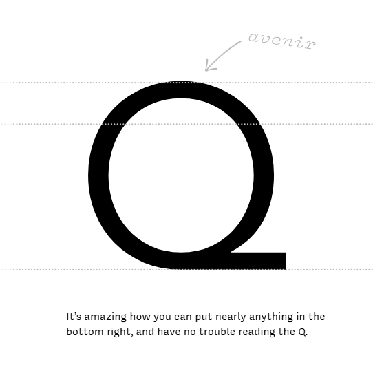
On one hand, letters are simple and readily recognizable symbols. But at the same time, their simplicity puts a lot of weight on seemingly minor elements. Small changes can have a big visual impact. The tour lays bare answers to questions such as: What is the optimal parting of the cheeks of a capital ‘B’? At what height should the crossbar on an ‘A’ sit, and why does it look so weird if done incorrectly? And yet, the tail of a ‘Q’ can be just about anything? How and why does an ‘H’ define the spacing of the entire typeface? All these (and more) are laid bare.

Continue reading “The Subtle Art Of Letterform Design”

Finding The Average Of Every Font

An old book – the smell, the texture of the slowly rotting paper, and the smudges and margin notes accrued over decades – is one of the finer points in life taken for granted much too often. We’re bombarded with high precision vector typefaces all day, but [Dan]’s Avería font is beautiful in its irregularity. [Dan] made a font that is the average of all the fonts installed on his computer, and the result looks surprisingly great.

[Dan] started his journey down the generative font path by making images of every letter of all his fonts and mashing them together with a PHP script. The result was a terribly blurry font, and unfortunately this had been done before. [Dan] wanted a font with clearly defined edges, though, so the obvious solution would be to take the grayscale result of his first experiment, set a threshold, and make a monochromatic image. This plan didn’t pan out, and [Dan] needed a cleverer way to go about things.

The solution to the problem is astonishingly simple; [Dan] took the perimeter of each font glyph and divided it into hundreds of points. These points could then be averaged in 2D space making a real ‘average’ font.

Even though this project isn’t the usual ‘Arduino doing something’ fare, [Dan] came up with a really clever way of doing something that produced something really cool. It’s enough of a hack in our books. Tip ‘o the hat to [Aleks Clark] for sending this one in.