Typeface (such as Times New Roman) refers to the design that gives a set of letters, numbers, and symbols their signature “look”. Font, on the other hand, is a specific implementation of a typeface, for example, Times New Roman Italic 12 pt.
Right about this point, some of you are nodding along and perhaps thinking “oh, that’s interesting,” while the rest of you are already hovering over your browser’s Back button. If you’re one of the former, you may be interested in checking out the (sort of) interactive tour of typography design elements by the Ohno Type School, a small group that loves design.
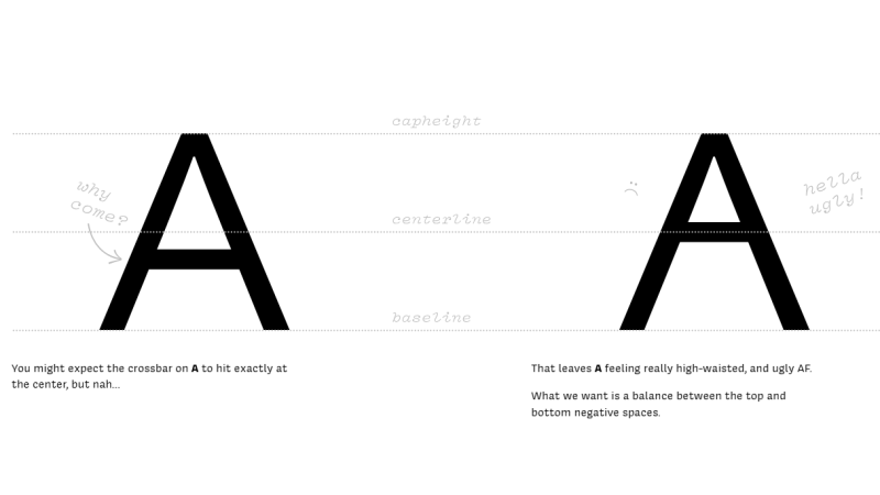
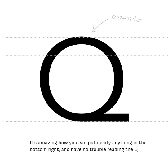
On one hand, letters are simple and readily recognizable symbols. But at the same time, their simplicity puts a lot of weight on seemingly minor elements. Small changes can have a big visual impact. The tour lays bare answers to questions such as: What is the optimal parting of the cheeks of a capital ‘B’? At what height should the crossbar on an ‘A’ sit, and why does it look so weird if done incorrectly? And yet, the tail of a ‘Q’ can be just about anything? How and why does an ‘H’ define the spacing of the entire typeface? All these (and more) are laid bare.
Font design in the hardware world is often constrained by display or memory limitations, but artistry in typography is still something that we’ve seen expressed in many different and wonderful ways over the years. For example, we covered a typeface whose symbols are not letters, but scope traces. And one enterprising fellow generated a new font (Avería) based on the average of every other font installed on his computer. The result was surprisingly attractive.


I’m glad you covered this and I’m going to explore further. I didn’t realize there was a difference between typeface and font.
Or
https://hackaday.com/2024/12/24/a-twenty-segment-display-artistically/
beautiful display
Sorry this original
https://www.youtube.com/watch?v=RTB5XhjbgZA
If this stuff interests you at all, or maybe even if it doesn’t, you’d do well to check out this video by Struthless:
https://youtu.be/WVfRxFwVHQc?si=9voTCgd_jFjF-Xk7
The title is “I promise this story about fonts is interesting” and the man does not lie. It’s a fantastic watch.
Lots of people like Comic Sans as a font, and of course typographers hate it, and have a long list of reasons why they hate it.
This got me to wondering whether there are aspects in the Comic Sans font that make it more readable, or more pleasant to read. The rounded ends of lines might not be as subtly jarring on the visual cortex, or the non-symmetric letters might provide better recognition (because the non-symmetry makes them unique) than symmetric ones, or maybe the font is more the “average” of all the other fonts, and so more easily is recognized by the higher level visual levels.
Font choice has consequences. I remember about a decade back when screens first started to appear in vehicles, and it was discovered that you could replace the font the manufacturers were using with a different font that was more readable, it would reduce accidents. A tiny improvement in the speed of recognition among readers translates, on average, to less time your eyes spend away from looking at the road. (I don’t remember which fonts.)
Comic sans is the “handwritten” font that people use to make text appear more informal and friendly. That’s what it was designed to do. It’s a bit crap on purpose.
I maintain my believe that comic sans is meant for comics
And so are many other comic fonts.
I like them for illustrative use and have a few installed myself.
It’s the other way around: it’s an imitation of hand-lettered comics.
Yeah exactly! And that’s why it rubs me the wrong way, too. As a parent, i see a lot of stuff the school sends home where they used Comic Sans to make it ‘fun’. And somehow their intent makes me angry every time i see the font.
To bad the website itself is an attack on usability of websites. Yes, you are very clever that you can make parts scroll sideways and other parts vertical, but it ruined your content.
Are you on a mobile device? Because it seems designed to be scrolled with a scroll wheel where you just keep scrolling to go through the vertical and horizontal content and the wheel is all you need.
Whatever this was supposed to be, this turned into crap.
I love a good font and appreciate (if not understand) all of the fine details that go into it. But font rendering is one of the quickest way to pull in a ton of nested, slow, buggy, hard-to-configure, and bitrotty garbage dependencies into a project. So i have developed a whole series of idiot fonts for my framebuffer-based guis. I have reused a couple but mostly i just reinvent it by whatever seems least effort at the moment. Variations on 7-segment displays and other sporadic ways to split up a fixed-dimension character cell.
And i’m happy with this foolishness haha. I really believe i spend less time making the world’s dumbest font from scratch than it would take to figure out how to get pango-cairo-freetype or whatever to
find a usable font from the library
render it into to an unsigned char buf[]
report pixel dimensions for layout
i’ve achieved that trio before but it always rots after a while, becomes able to access only some random unpleasant subset of my font library or something like that.